I’m interested in contemporary propaganda, and how it succeeds (and sometimes fails) in using the basic principles of design.
For example, the MTA’s “See Something Say Something” campaign.
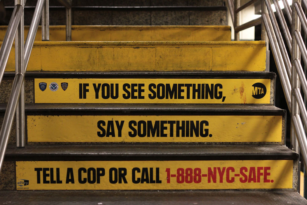
In this instance of the campaign, the designers cleverly used the the stairs themselves as a grid.
The negative space of the pieces shifts as the observer approaches and climbs the stairs.
The color palette of yellow, black and red is simple and striking. The font here is Plak Black Condensed – high contrast and readable.
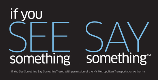
Security apparatuses across the nation have reproduced the slogan in their own designs, which I think speaks to the propagandist power of the original and the underlying paranoia that produced it. Here, for example, is the Department of Homeland Security’s version:
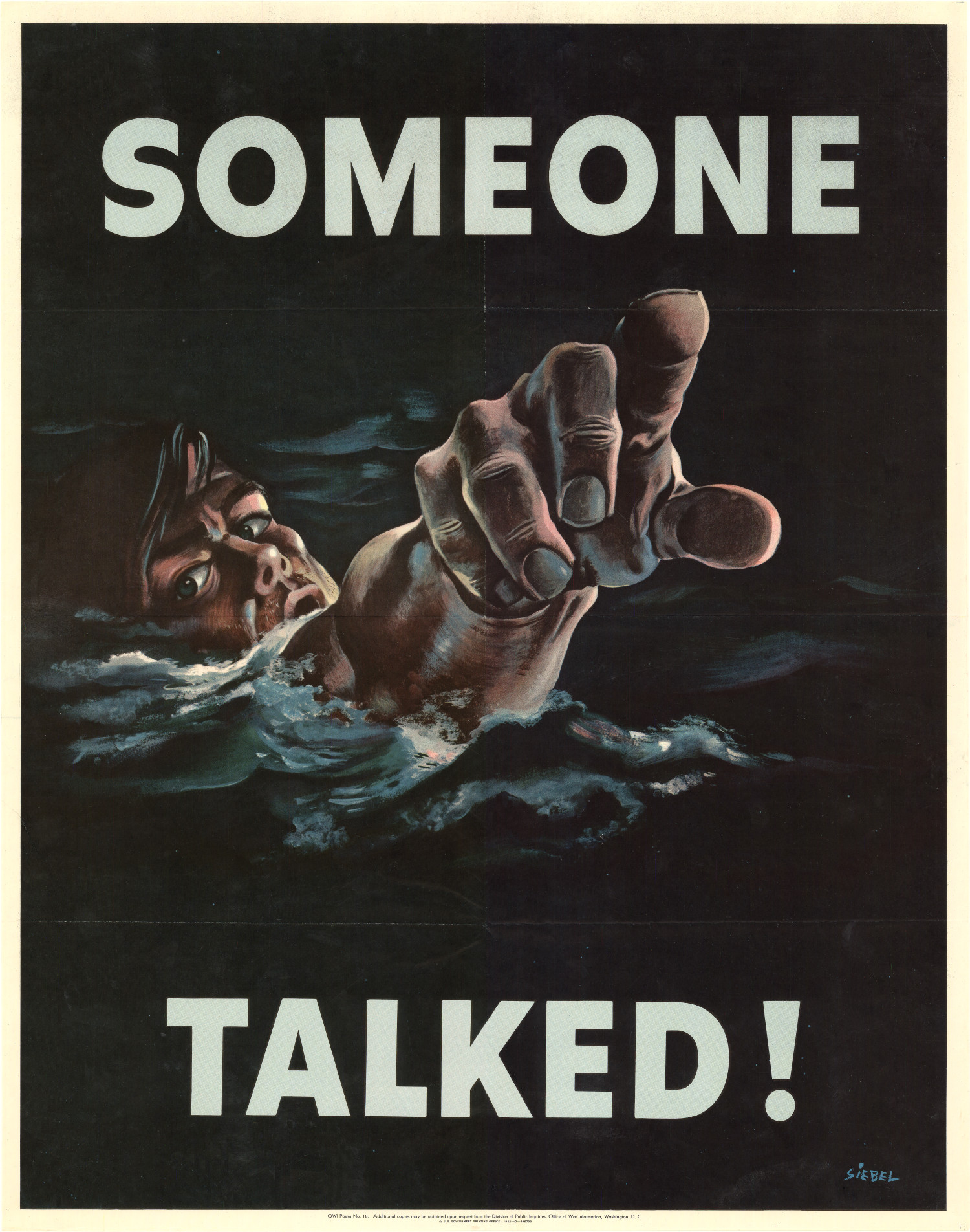
It’s quite a reversal from this WWII era piece, which shows the dire consequences of “saying something”.
Contrast these images with an FBI’s most wanted poster, and a smalltown anti-terrorist campaign.