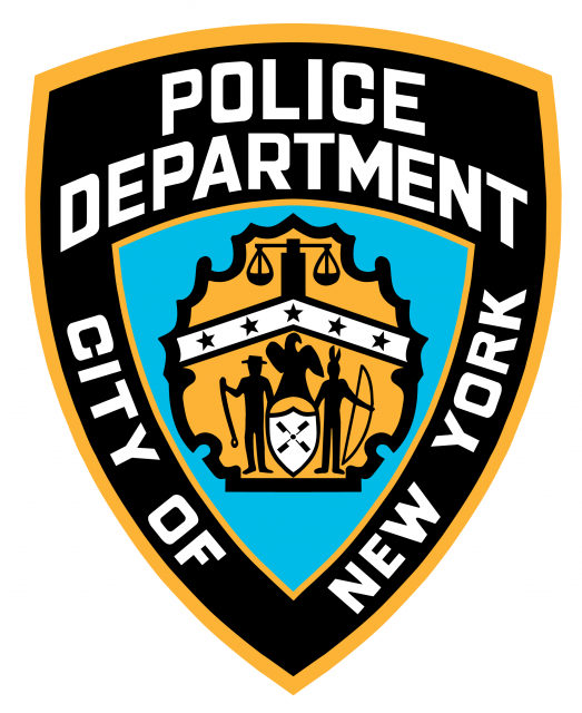
have you ever noticed that there’s a caricature of a Native American in the NYPD logo? Well there is.
Category Archives: Visual Language
business cards
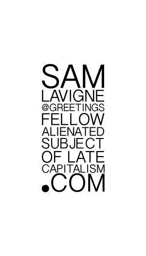
Here are my new business cards. Feel free to print your own. Also, let me know if you’d like a complimentary email address at GreetingsFellowAlienatedSubjectOfLateCapitalism.com.
typography
Signs in Greenpoint
Here are some of my favorite signs in Greenpoint.
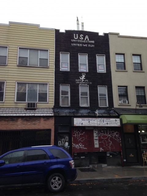
The message on this building is mysterious.
There is a kind of stacking approach at work here: the statue of liberty on top of the twin towers. And a mixup of slogans: “united we stand” is followed by “united we run” and then “run for life” is paired with “life begins at 70”.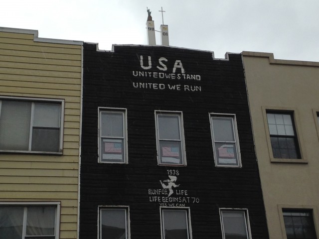
A sign about cloning on a Hearse.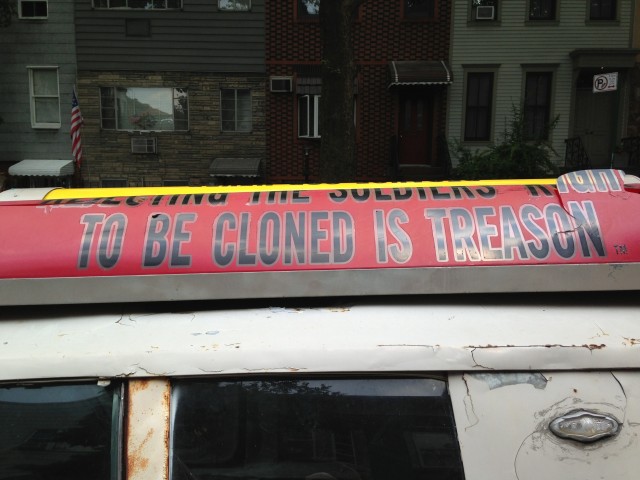
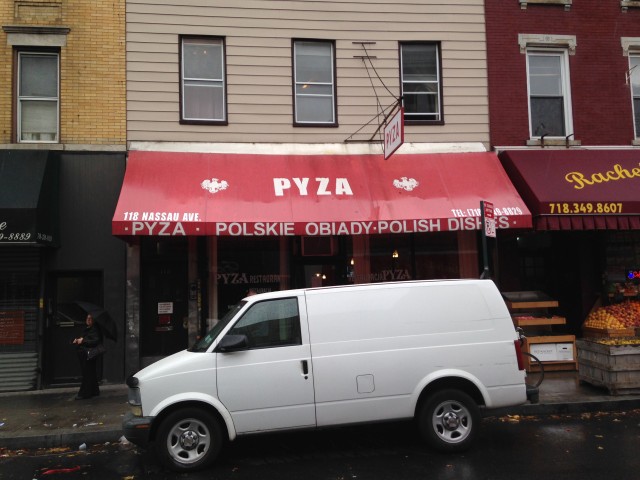
I like the look of this restaurant awning.
My favorite, Princess Manor – a banquet hall with an aspirational name.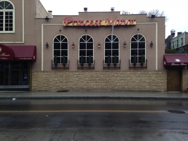
Sky Flower’s sign is fading and dripping away.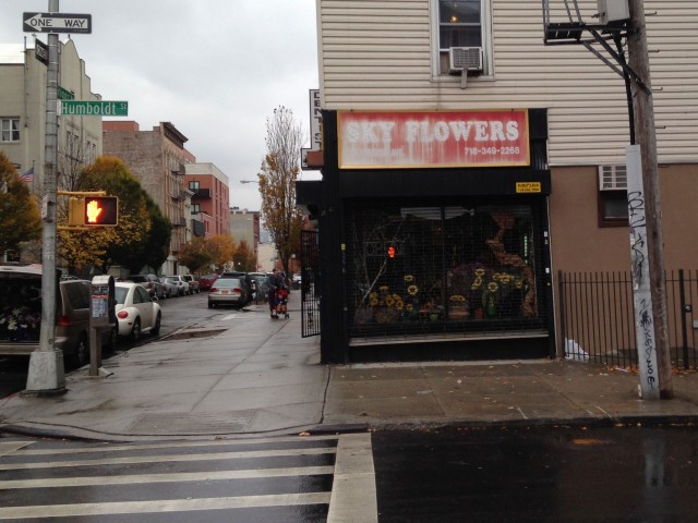
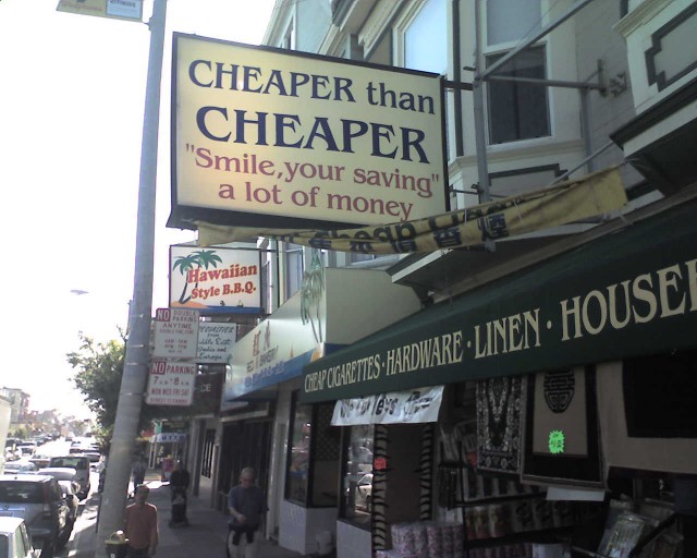
This is the best sign I’ve ever seen. It’s in San Francisco on Clement Street:
I did a quick redesign of the sign – I wanted to see what would happen if it looked really clean but kept the wordplay. The original is clearly better.

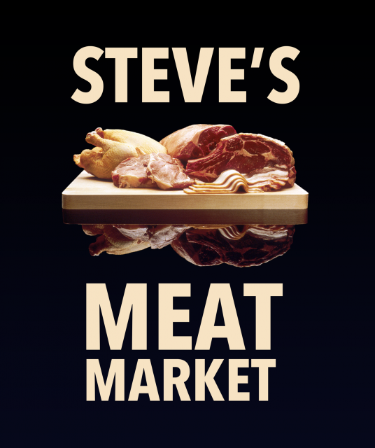
I love the look of “Steve’s Meat Market” but I thought I’d take a try at redesigning it anyway.
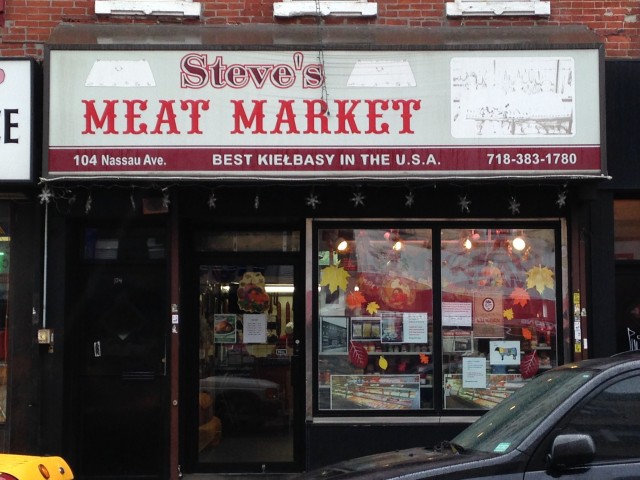
Here are two ideas I came up with. The meat image comes from the Wikipedia Entry on meat.
See something say something
I’m interested in contemporary propaganda, and how it succeeds (and sometimes fails) in using the basic principles of design.
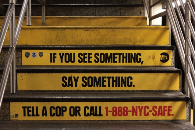
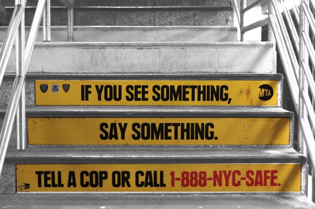
For example, the MTA’s “See Something Say Something” campaign.
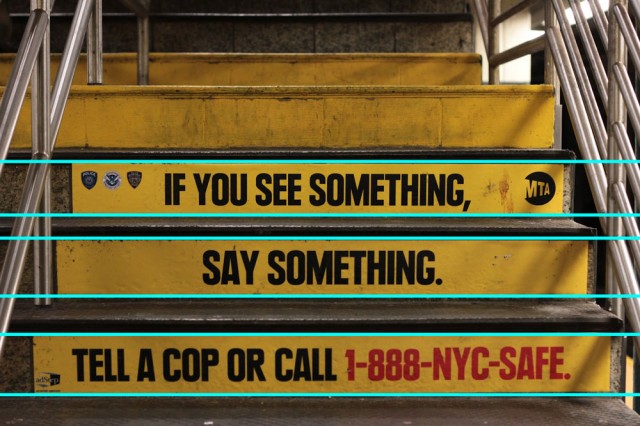
In this instance of the campaign, the designers cleverly used the the stairs themselves as a grid.
The negative space of the pieces shifts as the observer approaches and climbs the stairs.
The color palette of yellow, black and red is simple and striking. The font here is Plak Black Condensed – high contrast and readable.
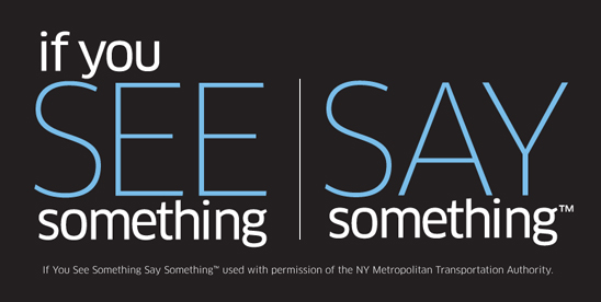
Security apparatuses across the nation have reproduced the slogan in their own designs, which I think speaks to the propagandist power of the original and the underlying paranoia that produced it. Here, for example, is the Department of Homeland Security’s version:
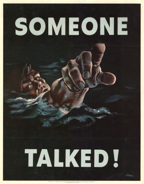
It’s quite a reversal from this WWII era piece, which shows the dire consequences of “saying something”.
Contrast these images with an FBI’s most wanted poster, and a smalltown anti-terrorist campaign.
